Most social apps start with a face. This one couldn't.
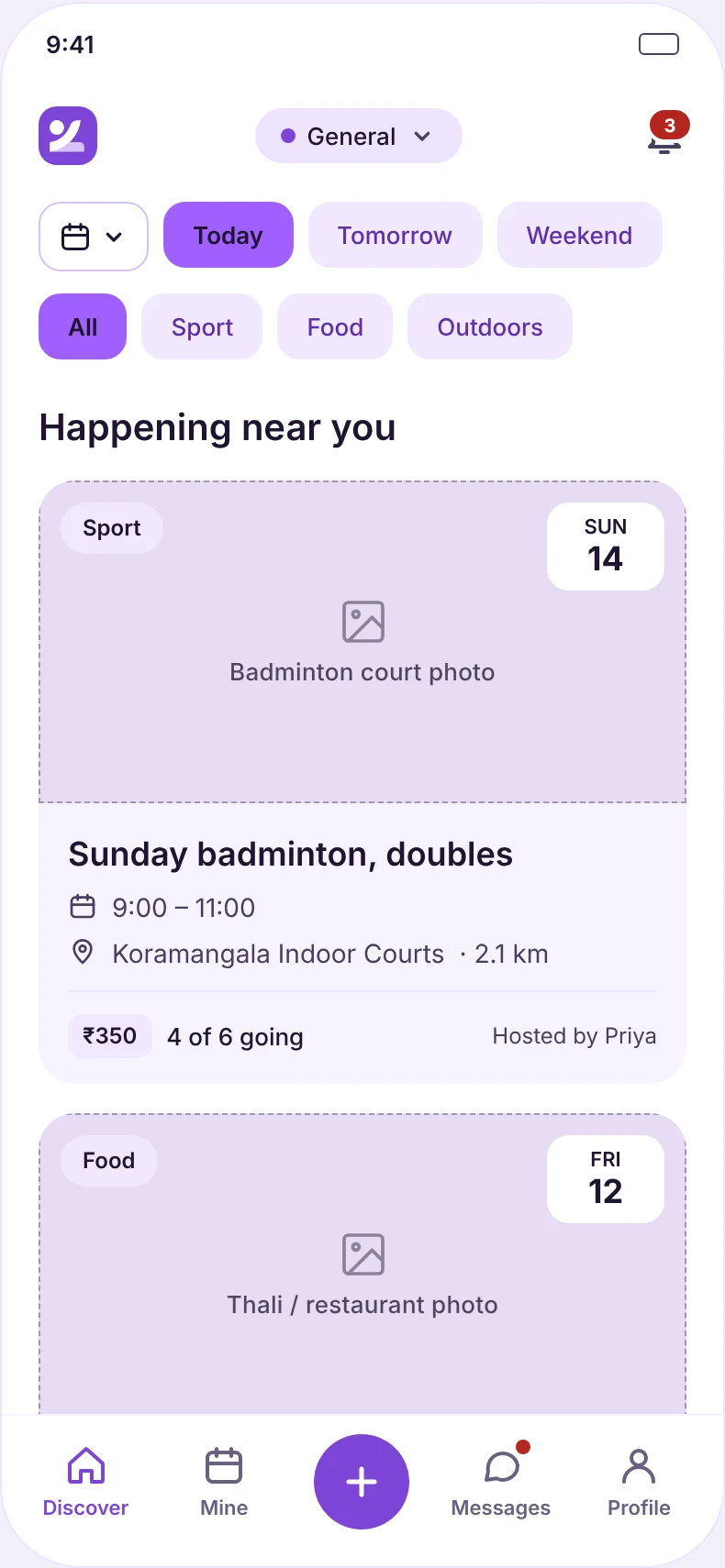
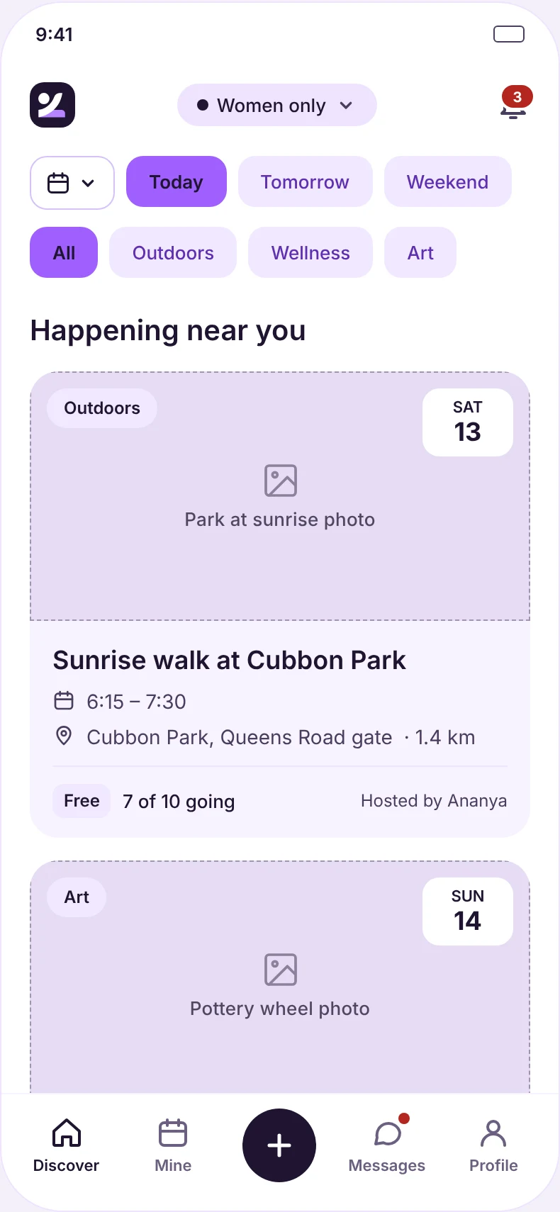
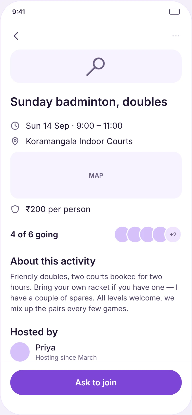
People want company for real things: Sunday badminton, a sunrise walk, a pottery class. Zliq lets anyone post a plan like that and lets others ask to join.
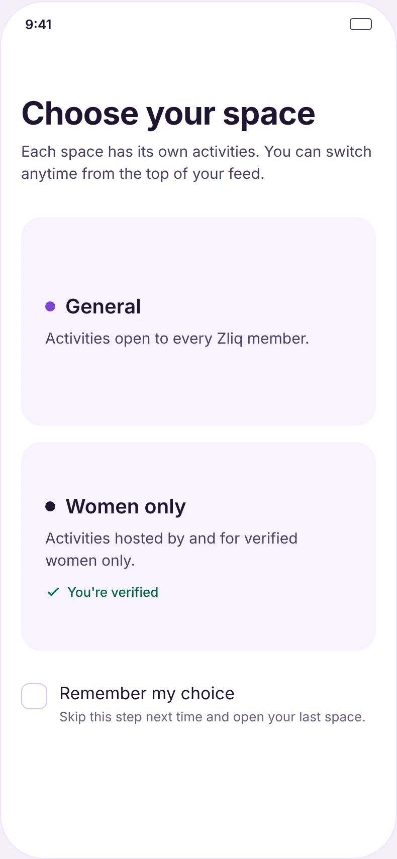
The trap is that apps for meeting strangers usually show you people first. That quietly turns "want to come along?" into "do I like the look of them?", and the whole thing starts to feel like a dating app. Zliq had to feel like a plan, not a profile feed. It also needed a women-only space where only verified women can host or join.
THE ONE RULE The first thing you meet is an activity, never a person.
Swiping, browsing people, and words like match, connect or "people near you".
A women-only space that is safe in practice, not just labelled safe.
One design for iOS and Android: shared structure, each platform's own chrome.
Map the whole app before drawing it
I drew the information architecture as one tree, so the whole app fit on a single page and every screen had a clear way in. As the plan grew, the IA picked up new modules: messages, a photo layer, ratings, host reconfirmation and a document check.
Before any low-fidelity work, I walked through what each addition meant for the experience and proposed a way to phase them, so the core of the app stayed focused.
Settled in one scoping call, before a single lo-fi screen:
- TWO-TIER CHECKA selfie match for everyone, and an ID check on top for the women-only space.
- CHAT LIVES IN THE PLANOne group chat per activity. No direct messages.
- RATINGS GO BOTH WAYSHosts and guests both rate, and an unrated plan blocks your next join request.
- PHASED, NOT CUTCore app first, then trust and safety extras, community and payments.
Five house rules, set before any pixel
Every screen was built from one shared set of components, so these rules were enforced by the parts themselves, not by remembering them.
- {{ r.n }}{{ r.t }}{{ r.d }} Rejected: {{ r.x }}
Try to join something
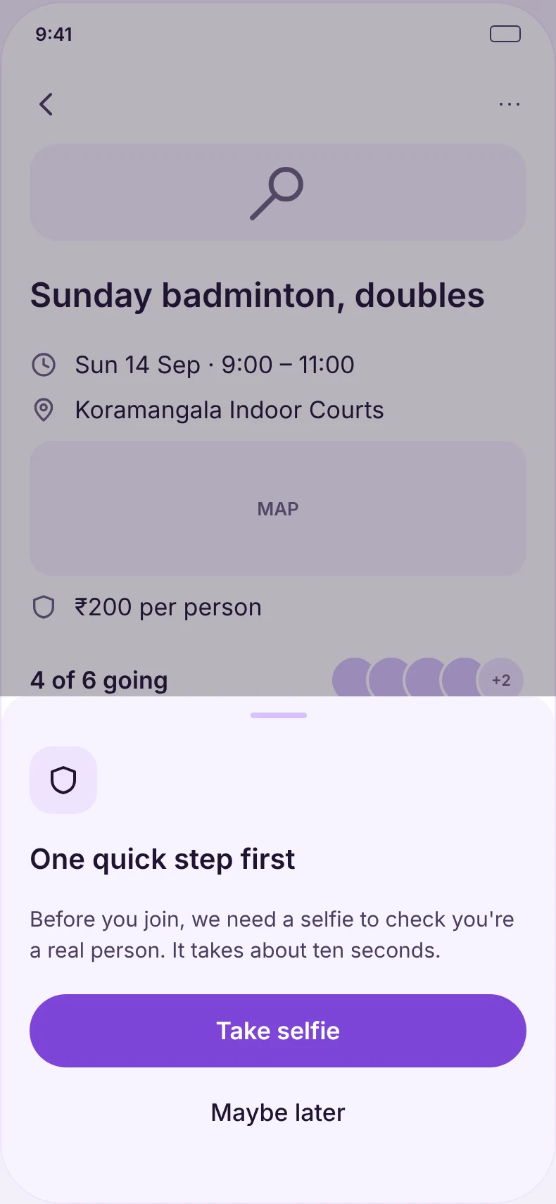
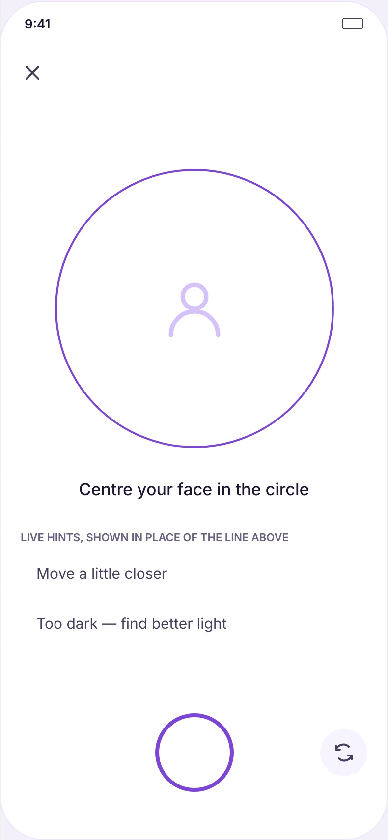
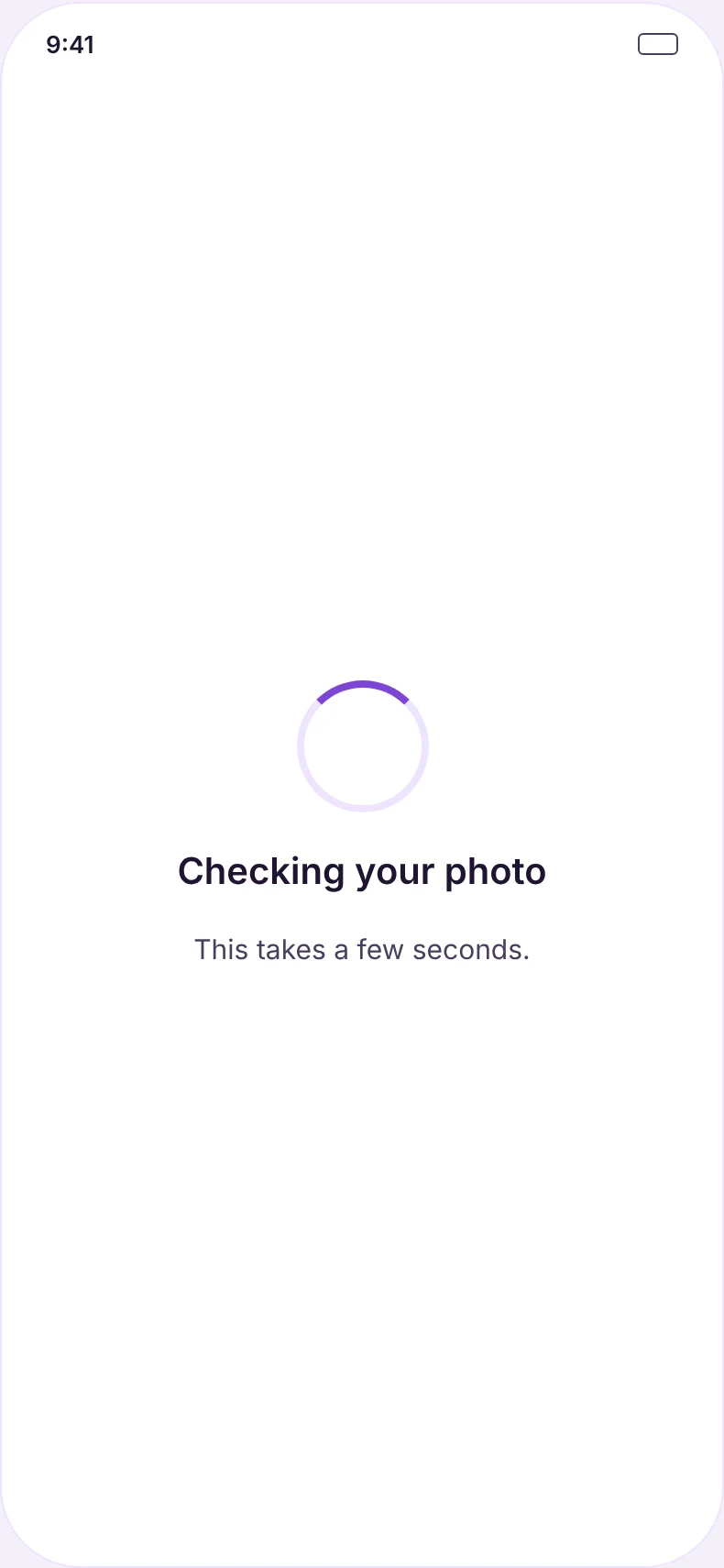
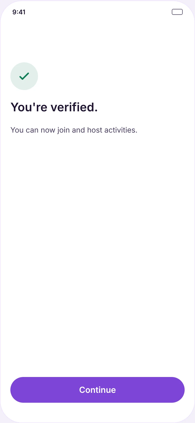
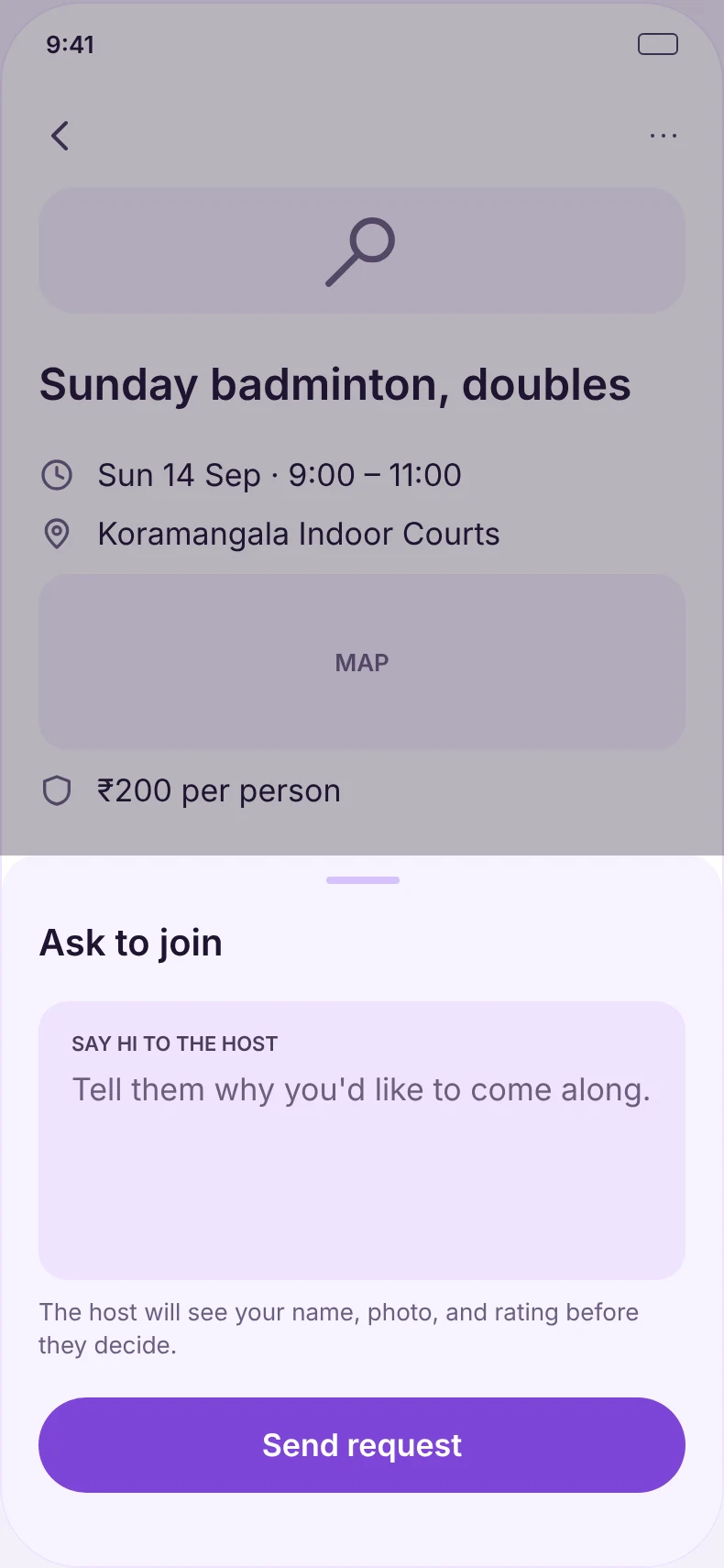
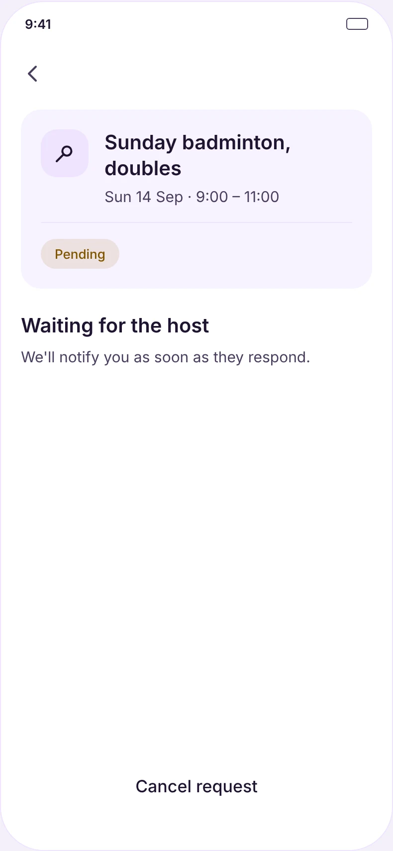
Where it stands
- ✓Scope and phases agreed before low-fidelity.
- ✓Foundations: colour, type, a 39-icon set and 15 components.
- ✓Annotated screens for iOS and Android, each reachable from the flow map.
- ✓A follow-up set for the edge cases: reporting, blocking, profile photos and past plans.
- ✓Store graphics and a developer handoff package.
- ◐In development.